
I loved the idea that the shelves would be full of all these name-brand and specialized candles for different sorts of rituals, but then Borgin & Burke's decided to get in on the game and make their own generic brand that would be good enough for all kinds of spells. Convenience and savings. I wonder what other markets they'd tap into? Herbs, probably. Athamés. Maybe a small, multi-purpose athamé, like a Swiss Army ritual knife. I'd buy one of those!
There we were, at our last Project Development Team Meeting (aka Juli & I sharing a half dozen apps at Chili's during Pokemon Community Day). She looked at me over a plate of cheese fries, narrowed her eyes, and said, "Okay, so, Autumn. I say we go full-on witch."
The waitress of course was confused, but I was all in. I tossed a ball at a Chikorita, swallowed the last of the southwest eggrolls, and replied with conviction. "Heck yeah."
I know I just talked about how I have a false start with every box we do, but this one was different. The Autumn DETC box (or DETC Occult as half of my files were named) is definitely the box of my heart. It's the box I've been waiting to make since we started this journey. Ever since I watched my first horror movies at 4 or 5, I've been fascinated by the dark and the scary. So until we do a robot- or pizza-themed box, this is my jam.
Not to say the box was all me. Don't let Juli's colorful hair or Steven Universe-esque glow fool you. She's got a nice, dark edge to her, and a lot of the coolest ideas were hers. "Hey Ham, make me a planchette coaster, which may or may not communicate with demons while at the same time keep tables clean and dry," she said to me. "Meanwhile I'm going to draw a picture of sexy, sexy Voldemort for a Tarot card." Her expansive knowledge of crystals ("They're minerals, Marie!") and their intended uses also came in handy for the box.
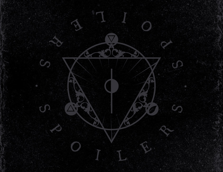
The first thing I did, of course, was make a playlist. Juli had to put up with a lot of Myrkur and King Dude for a while. My visual inspirations were The VVitch & Hereditary, both incredible films. I finished the planchette first, then the Morsmordre pin, then the logo. Each one was super fun to do. I've always tried to incorporate sacred geometry into my glass design, so it was great fun to be able to finally use it here for the store. Shapes are awesome.
I did my best to take care with symbology and meanings. A spell is created, after all, with intention, representation, and ritual. Drinking tea is already such an important ritual, so I hoped to be able to add some actual magic to the experience. The three symbols in the main logo are the alchemical symbols for water and fire, and a leaf to represent tea leaves. These are the three main elements you need to make tea (besides a mug with some sort of ironic slogan on it). You'll find sulphur (fire and brimstone, aka whence a demon lives) on the planchette. The chalice on the Drink of Despair label features an arsenic symbol (poison). And I've used seven-sided shapes liberally through many of the designs. Lord Voldemort believed there was power and perfection in the number seven and thus sought to split his soul into seven horcruxes. Not that I'm advocating that. But, you know. Seven is a cool number. Oh, and goats. Boy do I love goats. All my life. And so of course, because of the occult tie-ins, I was super psyched to put some goats into this box. I couldn't shoehorn them into any of my shape-based designs, so I began the candle with a goat in mind. I'd like to think that Borgin was a goat fan. He probably lived on a small farm just outside of London, where he tended to his billies and whittled tiny Death Eater masks out of old pine. Burke was probably allergic to animals, even though his wife kept an ever-increasing assortment of cats in their tiny apartment (poor Burke).
The candle designs were originally grittier and with a patterned background. The labels were too small to pull off that level of detail, though, so we had to scale back. Here are the original designs, for those interested:


Rough Latin translations are as follows:
Imperium Ex Bibe Magicae - Power From Drinking Magic
Bibistis Et Currere A Morte - We Drink to Outrun Death
Ut Praebibere Dominus Malum - We Toast the Dark Lord
And here is the art for the disc-shaped tea tins. Our original vision for this box was dark. So I made the labels dark. Then I lightened them. Then Juli leaned over my shoulder, squinted, and told me to lighten them more. And yet, I think you'll agree, they still came out pretty dark. So here they are in all their glory, where you can hopefully make out the details.


That's all the insight I have for this box. It's one of my favorites so far, and I hope you enjoyed it.